LEGO The FRIENDS Apartment Set 10292
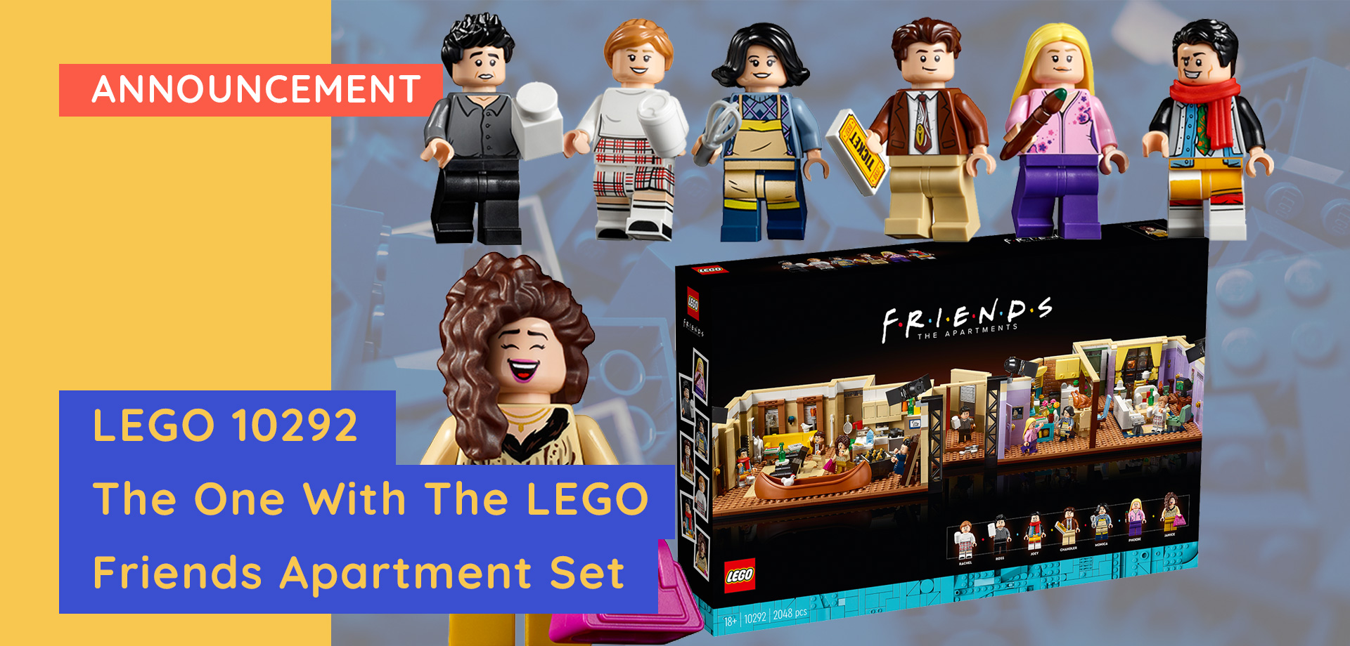
It was unexpected but warmly welcomed. LEGO has given us another F.R.I.E.N.D.S set! Dense with references, I found myself treating this set as a game of I-Spy.
Much like The Central Perk build, the two iconic apartments are built like a film set, making both sets completely interactive.
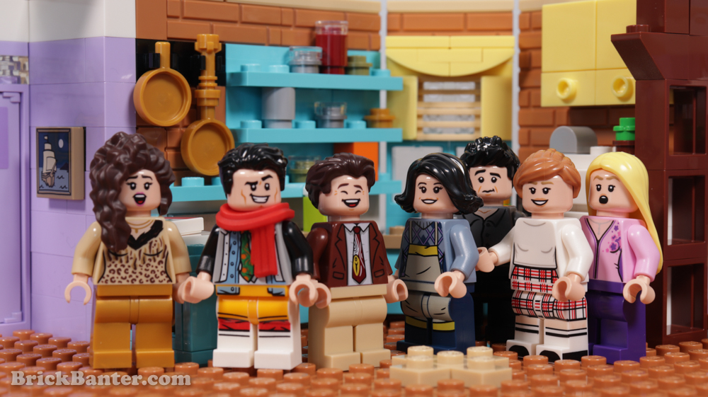
We receive a second iteration of each main character while also gaining a new side character, Janice! Honestly, the only thing left for LEGO to add to this theme is the iconic water fountain seen in every single intro.
-
RRP AUD $259.99 – CA $199.99 – EUR €149.99 – UK £134.99 – USA $149.99
-
2,048 pieces
-
Available from LEGO.com and LEGO Stores from 1st June 2021.

The Set
The set itself is a combination of Chandler’s apartment and Monica’s apartment. Giving us twice the size of Central Perk and twice the amount of references. Judging by the furniture, hair cuts and references. I believe we are looking at the time period in the middle of the series.
Unlike Central Perk which seems to refer to the early seasons. The presence of the canoe, Chick and Duck and a multitude of other references make this a die-hard fan’s dream.

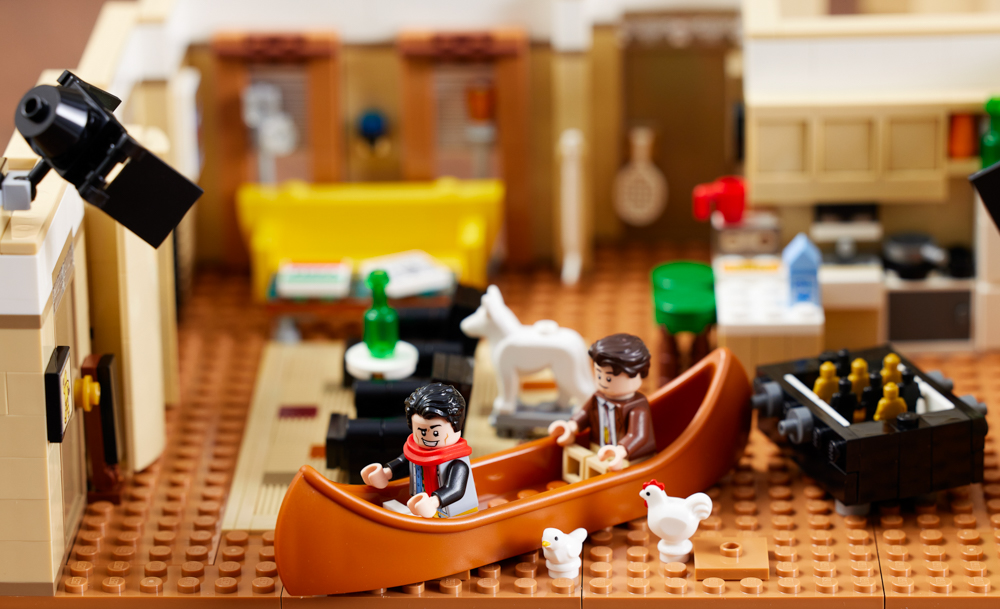
Particular stand out important features that I appreciate in Chandler’s apartment are the presence of the foosball table. The dual recliners (which both lean back in sync with each other) and the multi-option sticker on the back of the front door, where you can choose between three different whiteboard markings.
References
There is a long list of references to the show that come in this set, and the particular ones of note in Chandler’s apartment are listed below!
– The White dog statue from when Joey was temporarily rich.
– Canoe that Joey and Chandler traded for their large, oversized TV unit.
– Joey’s bought chicken as a gift that he couldn’t get refunded.
– Chandler’s pet duck that he brought home after saving the aforementioned chicken from being euthanized.
– Gladys the “Haunted Painting” made by Pheobe originally given to Monica, that was palmed off to Rachel and then sold to Joey.
– The various artworks on the walls, including the boxing kangaroo and the corkboard, with what I would only assume in locally advertised acting jobs.
The Inbetween
In between our two apartments is the small walkway up to the doors, where there isn’t too much going on. I appreciate the stickered window detailing to really set the aesthetic of the buildings.
But it doesn’t connect the apartments together like I thought it would. That being said, a good little nod from LEGO to still sneak in a reference to when Rachel and Chandler drop their halves of their cheesecake in the middle of the walkway. Joey catches them eating it off the floor, inevitably joining in.
Are the apartments connected you ask? No is the simple answer. There is no interlocking system to connect the two apartments with the hallway.
It’s a simple ‘slide into place’ system. Nothing a little creativity can’t fix if you wanted to.
Monica’s Apartment
Across the hallway, we have Monica’s apartment, one of the most iconic locations of the show and my personal favourite part of this set. The apartment is still approximately the same size as Chandler’s, however it utilises the space a lot better.

(LED light not included)
The dining setting is complete with mismatching chairs, as well as the funky bright poppy blue kitchen the place is known for. As an extra bonus, the apartment also includes the balcony for the cast to go out onto, which I was surprised by.
LEGO didn’t need to include the actual exterior balcony and could have simply left it a window, but they didn’t and I’m happy for that.
I love the pixelated embraided pillows on the lounge, the inclusion of Mrs Whiskerson, and Pheobe’s dollhouse, which is weirdly enough, in scale.
References
Here is a summarized list of all the references in Monica’s apartment.
– Mrs Whiskerson, the cat Rachel owned briefly and sold to Gunther.
– The Turkey is a reference to Joey never leaving a turkey unfinished, as well as Monica wearing a turkey on her head.
– The pole on the balcony, as when the cast poked their naked, presumed-dead, neighbour.
– “Dream Dollhouse” made by Pheobe in contention of Monica’s realistic less-playful dollhouse, which later caught on fire.
– Monica’s closet of shame, filled with clutter.
Apartments
The two apartments side by side do highlight a few unfortunate negatives about the set. For one, I would not call this set “Shelf friendly”, as the apartments are not aligned.
Monica’s apartment sits further back than Chandler’s. It would like fine to sit on a diagonal to counter this, if not for the walkway in the middle leading to a large open gap.
A small little touch of detail around the bend of the walkway would have really saved it a bit here.

Other than this, we also need to talk about the support beam in Monica’s apartment. I personally feel like it doesn’t really belong. It blocks out the openness of the apartment for display purposes.
It works well for Chandler’s apartment to not have this beam, not so much Monica’s. I can’t think of scene where this support beam was important.

The Minifigures
Joey
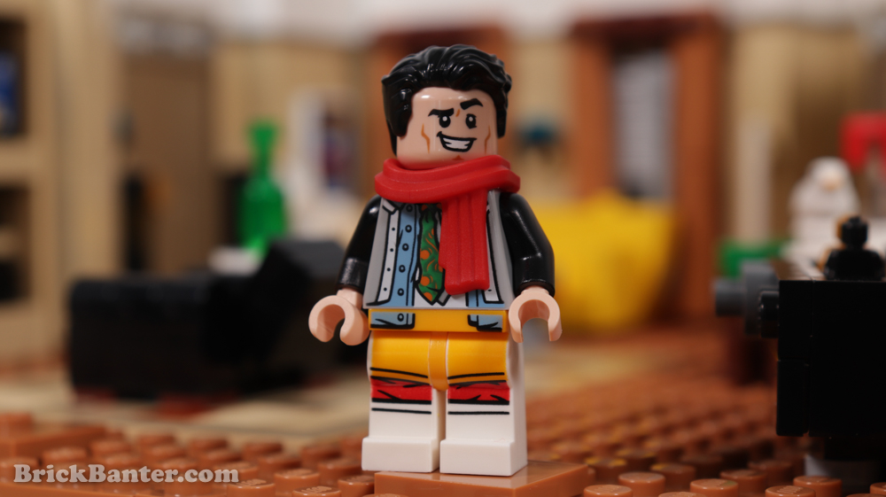
I appreciate the unexpected reference of Joey wearing all of Chandler’s clothing as revenge for Chandler hiding Joey’s underwear. Although Joey doesn’t wear a scarf in this scene, the addition of a scarf piece to the figure really helps give a sense of depth/thickness of the character.
If this is your first F.R.I.E.N.D.S. set, and you wanted to have Joey in normal clothes to recreate classic scenes? You would probably be best to pick up Central Perk ASAP, because other than recreating the reference. He sits out of place with everyone else. Don’t misinterpret me, I love this figure. Just might look a bit odd on display.
Rachel
Rachel vastly differs from her previous version. Her older version being the long-haired waitress, whereas this time around she is in more casual clothing, with a sweater and skirt combo.
The leg printing on this figure is absolutely amazing, having the pattern and boot detailing wrapping all around the sides of the leg.
One thing that does oddly set her apart from her predecessor is her hair. Not only is it now up in a ponytail, but it is also a completely different colour to the light-nougat colour and now burnt orange.
Rachel comes with an accessory coffee cup, which would have been nice to have with a Central Perk logo on it.
Ross
Following Rachel, just like the show, is Ross, who is seen depicted in his tight black leather pants. This is a reference to an episode where he could not get his pants back on for a date. So he resorts to a lot of talcum powder to get them back on, which escalates to a mess. Thus, his accessory is the container of talcum powder.
Or is it the moisturiser that he tries? Both are white containers. There is not much to note in regard to printing for Ross, as he only has printing on his torso. Which helps sell the tightness of his blank pants with subtle tight printing on the baseline of it.
Phoebe
Phoebe is much like Rachel, with a significant departure from her predecessor. Her hairpiece has been changed, which admittedly. Both work, and her outfit has changed to a pink cardigan rather than her older style aesthetic.
Phoebe wore a lot of skirts and dresses on the show, but LEGO have given her solid purple pants instead. This would mainly be to incorporate her in diorama settings where she sits on the couch. But I do wish she had some more individuality in her character printings.
The paintbrush accessory is a bit left field, as Pheobe is more musically inclined, but this may simply be associated with her painting of Gladys and the Dream House Dollhouse.
Chandler Bing
Chandler Bing has one immediate feature that draws attention, his tie. This is a reference to Chandler’s affinity for ugly neckties, and as to which tie exactly this references, we admittedly do not know. It definitely appeared in one of the episodes but wasn’t significant enough of a plot point.
Chandler also comes with a much happier laughing expression, compared to his predecessor’s quite unhappy scowl, which is a fantastic addition.
This version of Chandler and his older version are both very different from one another, but both immediately iconic to the character, which is very hard to do. Massive props to LEGO on this one.
Monica
Monica sports her later season short black hair, and is adorned in an apron ready to cook! I really like the detailing on her torso print for her woolly jumper, and even though it may be mainly covered. It is appreciated nonetheless. Monica is clearly at home in her apartment, and definitely is a great evolution of the character, both physically and developmentally on the show.
She comes equipped with a whisk, which is rather unsurprising, given her getup.
Janice
Our 7th figure in the set is one of the show’s main reoccurring characters, whom of which we all love to hate. Janice uses Bellatrix Lestrange’s hairpiece in a new brown colour, which could not be more suited to the character if we tried.
Equipped with her handbag and adorned in a very dated cheetah-like aesthetic, Janice is almost a completely perfect figure. She just seems a little off with a solid gold coloured leg choice.
Maybe her outfit just needed a little bit more printing over her waistline to thigh area. Her expressions are spot on, including her laughing face, which, despite not emitting sound, makes my ears bleed from her laughter in my mind.
Closing thoughts on the set is that it is a good addition to any die-hard F.R.I.E.N.D.S. fan, packed with references throughout the seasons that all fans could enjoy. An afterthought we had from looking at this set and its previous version, is that AFOLS who have both of these technically have both Pheobe and her twin sister Ursula!
Although we do love this set, there are small spots for improvement. Monica’s apartment could have had more room for references, such as the Ugly Lamp, being more selective with what is on the TV, etc. The only true major gripe I have is the lack of continuation of the corridor. Without this properly stretching around the bend, being able to display this set on a shelf might be quite problematic. Who knows if LEGO will make more of these in the future. What would be next? Ross’ apartment? The fountain in the intro? We will have to see how this goes, we thought that they would never make a follow-up set to F.R.I.E.N.D.S., and yet, here we are!
Available from LEGO.com and LEGO Stores from 1st June 2021.
Thank you for reading
Support BrickBanter.com by shopping for your LEGO® via the affiliate links below.
It’ll cost you nothing but will mean the world to us. 🫶
🇦🇺 Australia – 🇨🇦 Canada – 🇪🇺 Europe – 🇬🇧 United Kingdom – 🇺🇸 United States – 💛 Everyone else
Explore more articles

BrickBanter.com is a recognized LEGO® Fan Media account.
Review sets are supplied by the LEGO group.


